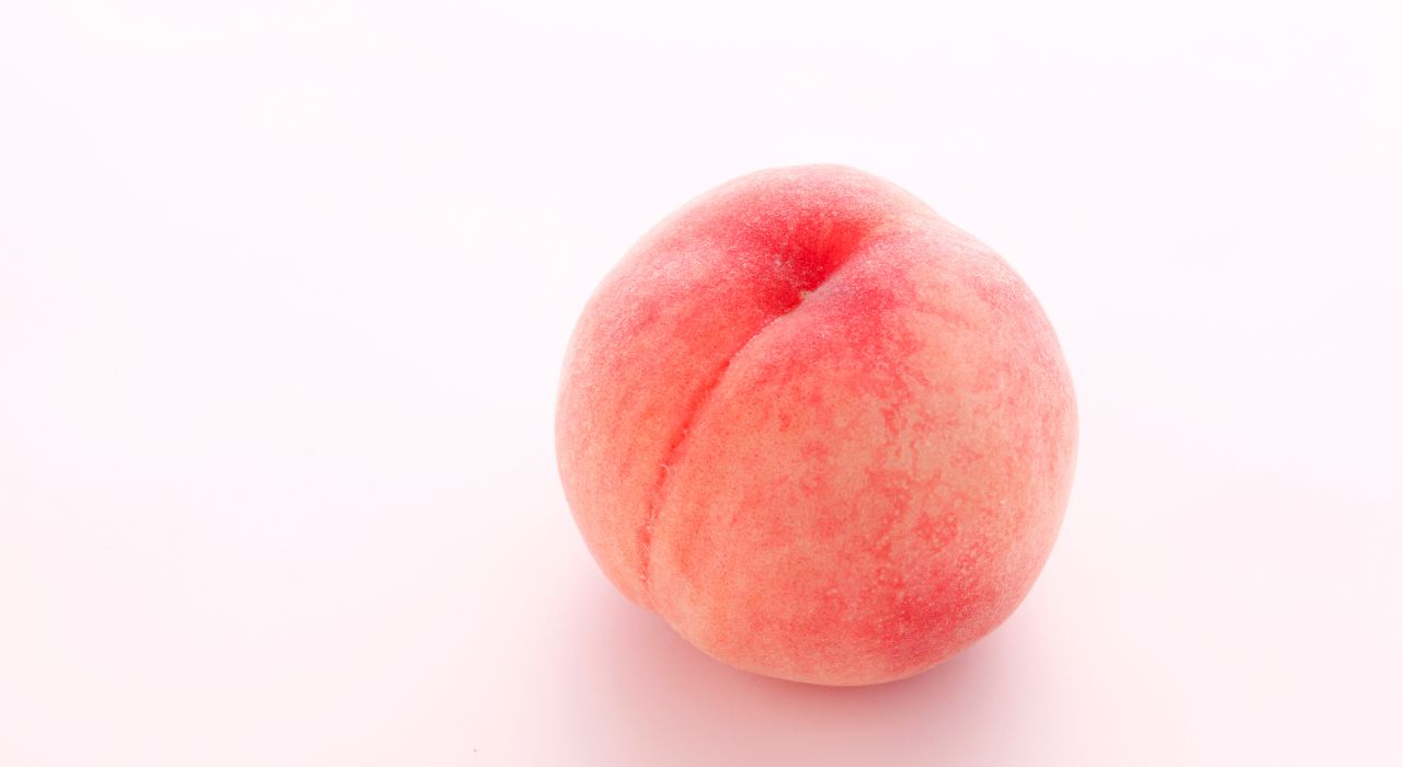
When it comes to 2024 colour palettes, the Pantone palette of 2024 is Peach Fuzz! How can this look in a website design?
When using Peach Fuzz in fashion, it's essential to consider personal style, skin tone, and the occasion. The same goes for your website or design project,
Pantone's Colour of the Year for 2024, "Peach Fuzz", has captured the attention of designers worldwide. In this article, we will delve into the beauty of "Peach Fuzz" and explore how to incorporate it into web design, as well as whether it's a good idea.
According to Leatrice Eiseman, executive director at the Pantone Color Institute, "Peach Fuzz" was chosen to reflect our current “need for nurturing, empathy, and compassion.” It’s an optimistic colour (Pantone’s other descriptors include “soft futurism” and “sanctuary”). Eiseman points out that the last few years have been filled with economic turmoil and global strife, causing many to reflect on their current lifestyles and make major changes. “The past has happened, there’s no going back,” she says. “Now we’re thinking, how do we want to live our lives?” Peach Fuzz is intended to be inspiring and nurturing, a color that can “give permission.”
"Peach Fuzz" pairs beautifully with neutrals like white, beige, and grey, but it can also work with complementary shades like soft blues, mint greens, muted corals or navy. Its offers warm inviting tones, is a colour that exudes a sense of comfort and positivity. It combines the softness of peach with a subtle hint of apricot, creating a hue that feels both familiar and fresh. This colour choice reflects a yearning for optimism and a return to the simple joys of life. But use it in your design with caution.
Peach Fuzz Colour Palettes
Analogous Scheme
Secondary colours chosen symmetrically around the colour wheel
Triadic Scheme
3 colours equally spaced around the colour wheel
Split-Complementary Scheme
2 colours placed symmetrically around the chosen colour on the colour wheel
Tetradic Scheme
Secondary colours chosen symmetrically around the colour wheel
Square Scheme
3 colours equally spaced around the colour wheel
Complementary Scheme
Secondary colours chosen symmetrically around the colour wheel
Neutral Scheme
3 colours equally spaced around the colour wheel
.
Using The Peach Fuzz colour palettes in Web Design
- Backgrounds "Peach Fuzz" can be used as a background colour to infuse your website with a sense of warmth and approachability. It pairs exceptionally well with white, off-white or black text, ensuring readability and a pleasing contrast.
- Buttons and Call-to-Actions Incorporate "Peach Fuzz" into your buttons, links, and call-to-action elements. The soft and inviting nature of this colour can encourage user engagement and interaction.
- Icons and Illustrations Consider using "Peach Fuzz" for icons and illustrations that convey a friendly and welcoming atmosphere. This can be especially effective for websites in hospitality, wellness, and lifestyle niches.
- Accents and Highlights "Peach Fuzz" can serve as an accent colour to draw attention to specific elements on your website. Whether it's highlighting important information or creating visual hierarchy, this colour can be an effective tool.
- Gradient Effects Combine "Peach Fuzz" with other complementary colours in gradient effects to add depth and dimension to your web design. The gradual transition from "Peach Fuzz" to a deeper shade can create a visually stunning effect.
Is Peach Fuzz in Design a Good Idea?
The choice of "Peach Fuzz" in design can be a good idea under the right circumstances. Here are some considerations
- Alignment with Brand If "Peach Fuzz" aligns with your brand's identity and values, it can be a fantastic choice. For brands aiming to evoke feelings of warmth, positivity, and approachability, this colour can resonate with their audience.
- Marketing and Branding We have a unique chance to utilise the captivating potential of "Peach Fuzz". This colour is naturally predisposed to attract public interest, making it an ideal choice for crafting visually enticing marketing campaigns, product packaging, and advertising approaches that resonate with the current consumer sentiment.
- Product Design The choice of "Peach Fuzz" will also influence product design across some sectors, including technology, home decor, and consumer goods. This colour can offer a unique aesthetic appeal, making products stand out in specifically well aligned markets.
- Target Audience Consider your target audience. "Peach Fuzz" may be particularly appealing to demographics that appreciate soft and inviting aesthetics, such as wellness seekers, lifestyle enthusiasts, or family-oriented audiences.
- Balance and Contrast Ensure that "Peach Fuzz" is used in harmony with other colours and maintains readability. Use it as a primary colour or as an accent to achieve balance and contrast.
- Accessibility Always check the accessibility of your colour choices to ensure that your website remains inclusive to all users. Contrast ratios with text and background should meet accessibility standards.

Pantone's Colour of the Year 2024, offers a delightful opportunity for web designers, digital designers and marketers to infuse their projects with warmth and optimism. When used thoughtfully and in alignment with brand identity and target audience preferences, "Peach Fuzz" can be a captivating addition to your design palette. Remember that successful design is not just about following trends but also about creating meaningful and user-friendly experiences. So, go ahead and explore the charm of "Peach Fuzz" in your design endeavours mindfully.


